On this site, we have taken the liberty to show you the best of the best launchers. They are meant to make your phone stand out. To bring out your personality such that when you use it, someone goes woah, where did you get that! . Be it simple or outgoing, you get to choose. However today we’re are looking at something different from the norm. A launcher made to make you use your phone less. Crazy, I know… but hear us out.
We spotted this launcher while surfing through the web and couldn’t help but test it. It’s called the Ratio launcher. The main aim of this is to get you back in control of your life.
Ratio Launcher: What’s It All About?
Ratio is a launcher that optimizes your digital life with a minimalistic design, straight forward app organization, and consolidated messaging. Let’s focus on these three aspects.
Minimalistic Design: Root
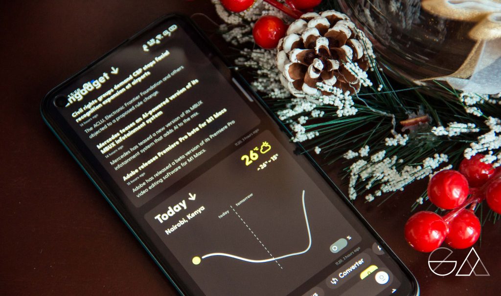

Weather
The Root Tab on your left consolidates all the important apps you need to get through your day. They include:
- Calendar
- News
- Notes and Todo lists
- Weather
- Ride-hailing
- Calculator
- Currency Converter
- Search
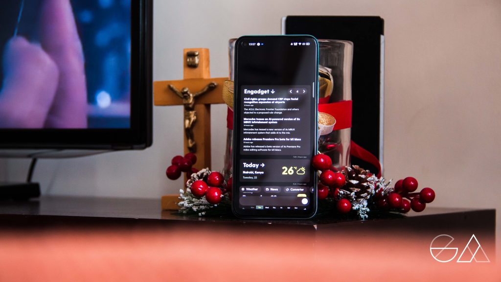

News
Their aim is to keep them all on one page so you don’t waste time hunting, paying, or getting lost in distractions.
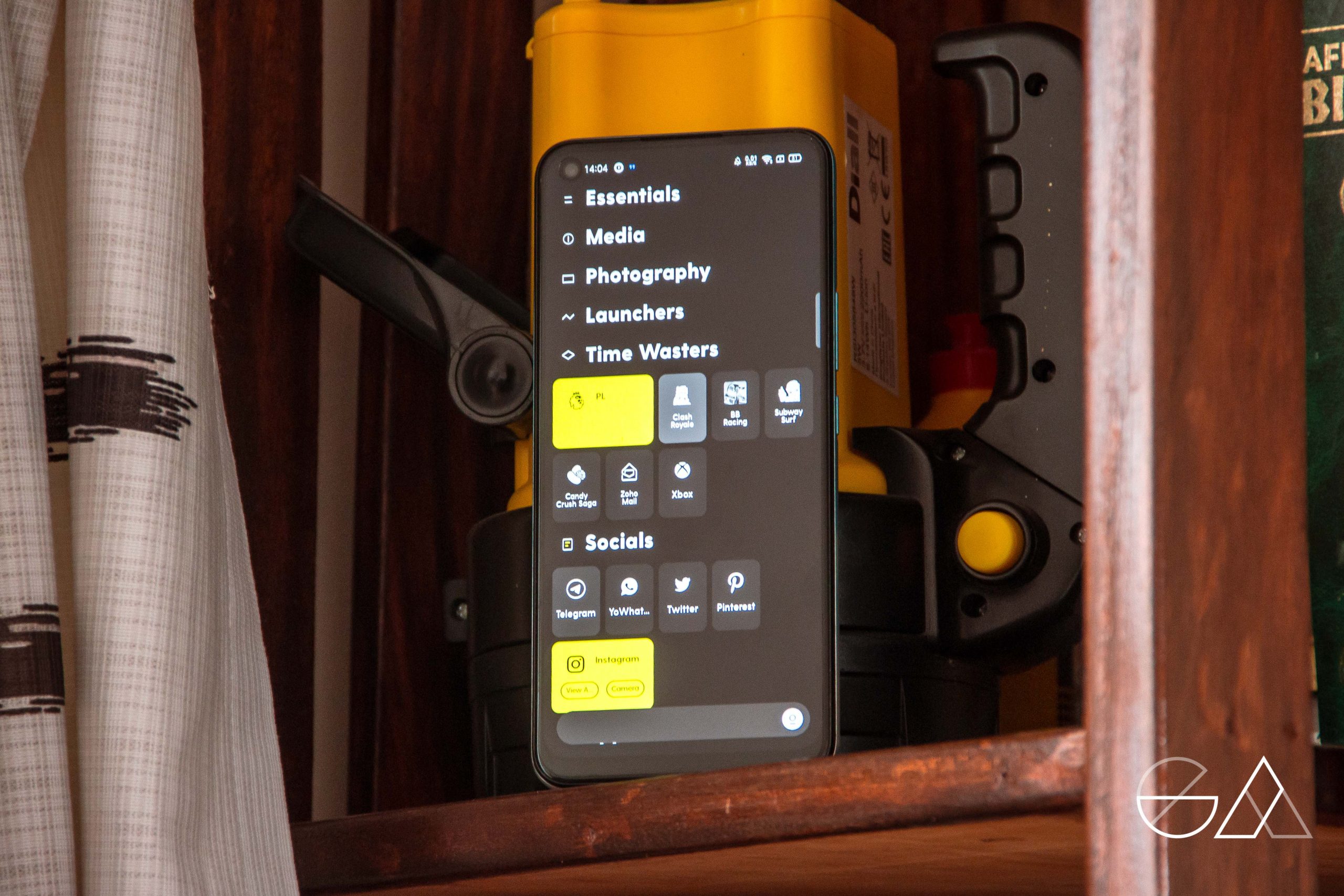
App Organization: Tiles
You can have your apps categorized based on what’s most relevant to you. For instance, here’s how I sorted mine out:
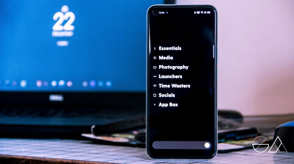

They will all be sort into drawers, which you then open to reveal all the apps you have set up as seen below.

Consolidated Messaging: Tree
Ratio also aggregates and merges conversations across all messaging apps so you do not have to keep switching apps. It’s still in it’s beta phase so we really expect a lot from it as time moves on.
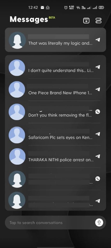

We tried it as a group and the results were undefined so we got some extra testers and this is what we think of the Ratio Launcher thus far.
Saruni’s Take
Likes
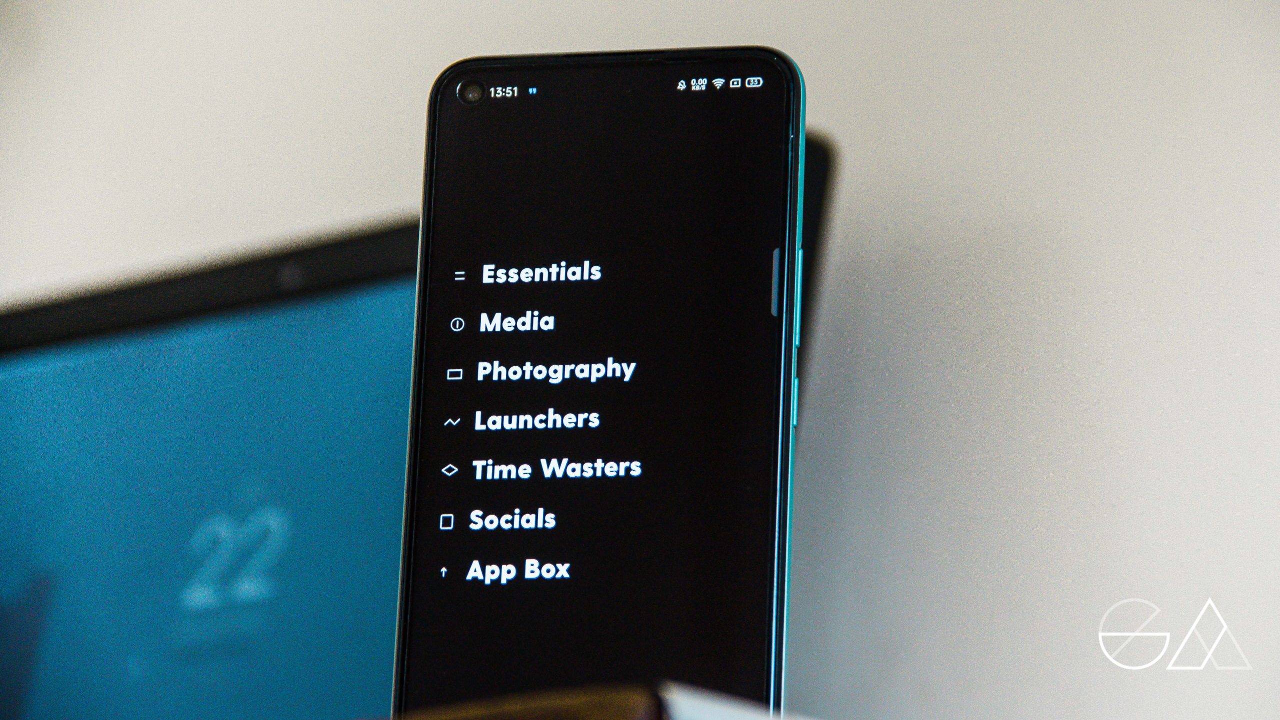

I am not using it because of the focusing feature, I just think it looks really cool. The whole aspect of having your phone with such a minimalistic launcher fascinates me.
Dislikes:
The Black and White Icons: I wish the icons were coloured. I know it beats the whole purpose of making your phone boring enough not to use but I just wish there was an option to have the best of both worlds.
The Messages tab: It looked like a good idea at first but after a short while, it quickly gets overwhelming… I would prefer if the section was more customizable, where I’d pick what apps I want to send their notifications there and not just message.
“It’s a good concept but I don’t want group messages appearing. I wish it wouldn’t show messages from muted contacts and groups.”
Dennis’ Take
I dont like it at all.
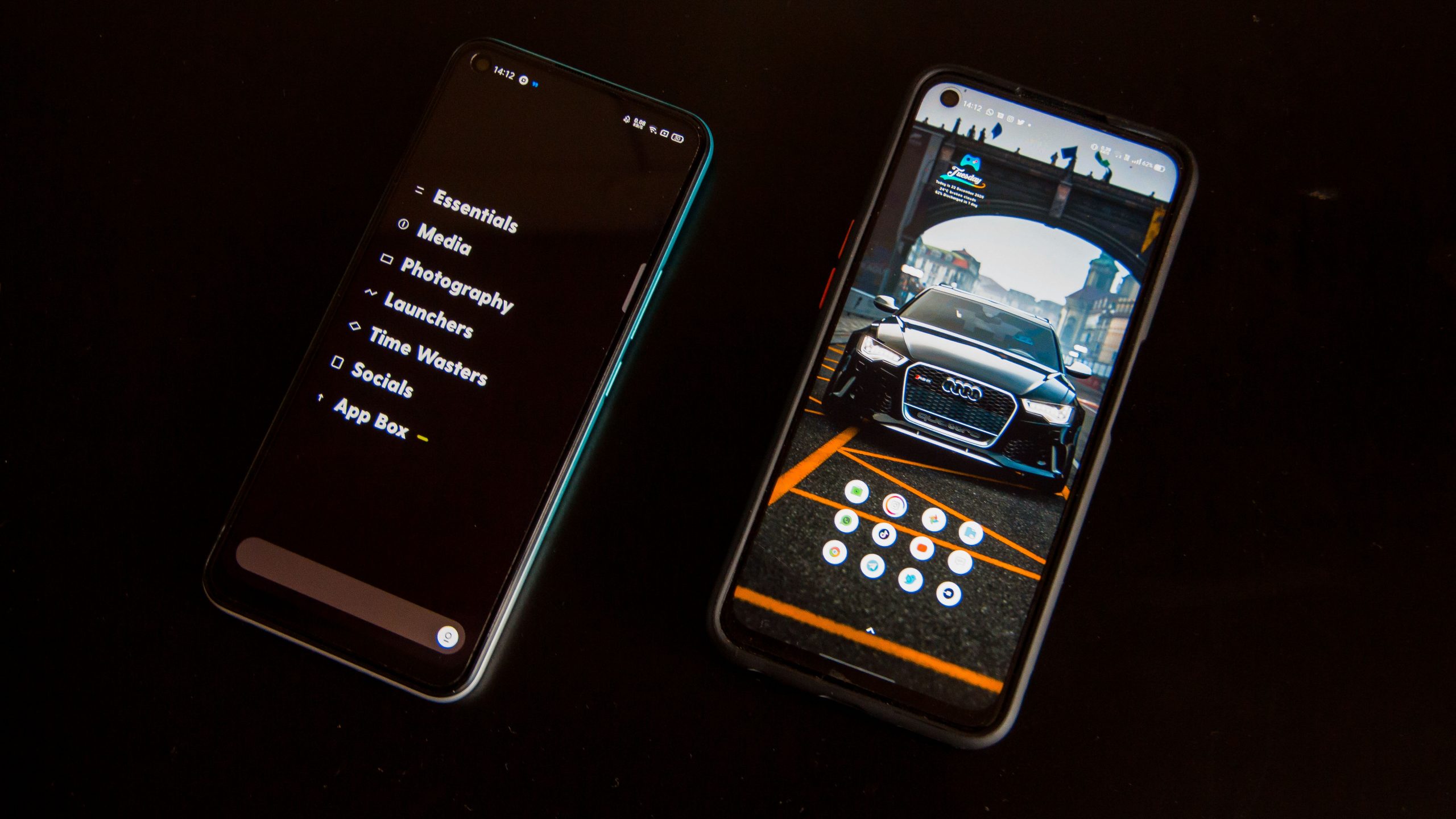

I do not appreciate the grey look and the organization of apps. I prefer colour and my apps at the bottom of the screen. It looks clean and minimalistic but also confusing and dull. Personally it just feels like Windows to me…
The Testers Take
Well, for one it didn’t work so well. It is extremely buggy. He uses a Xiaomi and maybe that could be the reason but he had to uninstall it because it is basically unusable.
For the other, she loved it but only had one complain, the black and white monochrome feel. Otherwise, she liked that it made her phone boring enough not to want to keep using it and thus it serves its purpose.
My Take
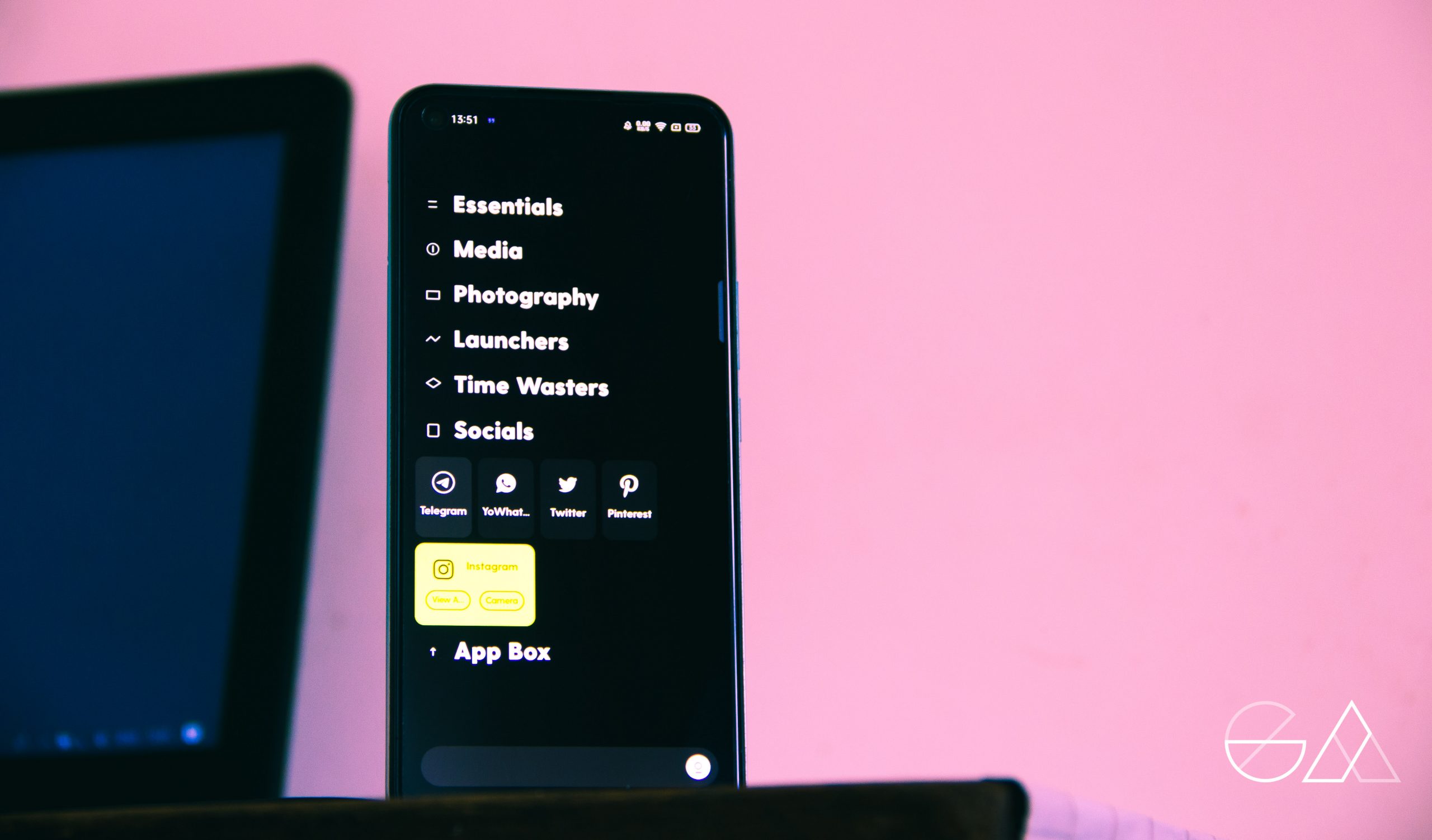

I think I resonate with everyone on this post. At first I was the Dennis type. I didn’t like it. I want colour. I want my phone to screem colour when I unlock it. Someone worked hard to make those icons, to put a vibrant screen on my phone and I want to embrace all that.
However, after a while I join Saruni and realize that the launcher works really well to give me exactly what I need. Seeing the TikTokor Instagram icon always makes me want to click on it and sometimes I end up forgetting why I picked up my phone.
Seeing every app in black and white, hidden in drawers whith that entire monochrome feel made me use my phone much less than I would before. Thus with that the launcher meets its purpose.
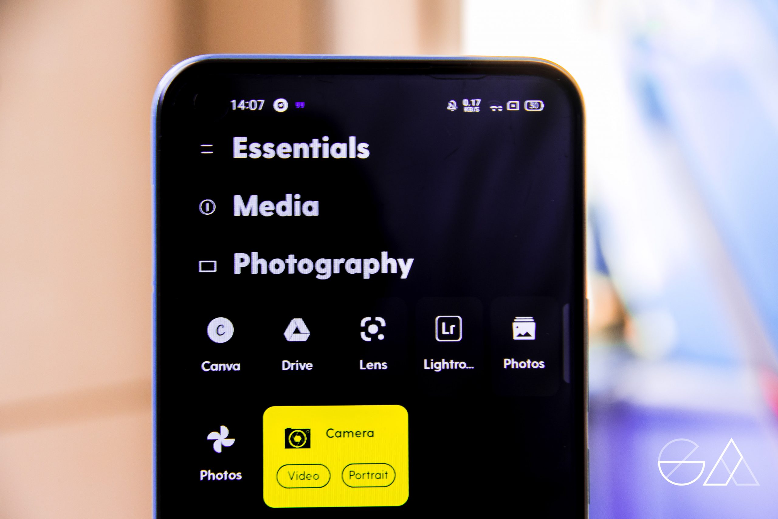

Whether its the best, we are not sure but it definitely does what it was made to do. Maybe I don’t necessarily want to unlock my new phone and find that but as a personal decision, it does the job hands down.




http://accessbridgepharmacy.com/# AccessBridge Pharmacy
mexican pharmacy what to buy: pharmacy delivery – best mexican online pharmacy