COVID-19, or the coronavirus, is still causing havoc across the globe. More and more numbers of cases are being confirmed in various countries even in Africa, including Kenya. In case you are curious about all the specific numbers in every country and region, there are some of the most useful COVID-19 map trackers we’ve been able to find online.
Currently, there are a number of apps, websites and maps out there. And as much as there are some out there that aren’t as legit, a number are proving to be quite useful and genuine.
This is mainly because they are created from reputably-sourced data and come from legit organisations.
Start off your week with tech news recap and trending conversations in your inbox
Note: There are a number of fake dashboards that look virtually identical to the real ones below that are designed to infect your computer with malicious files. You can find more information here. Where possible, stick to the ones we’ve linked below — the Johns Hopkins and WHO dashboards come directly from the websites of the respective organizations. Check the URLs of the dashboards to ensure you’re not using a lookalike, and, as always, never download anything from an unfamiliar site when prompted to.
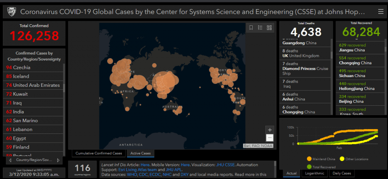
Johns Hopkins University COVID-19 Map
A lot of these maps offering data obtain theirs from Johns Hopkins University based in the US. However, the university also offers its own map. The map itself seems pretty accurate showcasing numbers of confirmed cases and deaths in every country. All you have to do is click/tap on one of the circles to get the info.
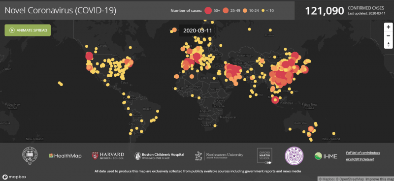
HealthMap
HealthMap is as accurate as it can get but with an extra touch of animation. If you are looking for a visually pleasing site with a good dark mode that still provides the right info then click on to the site. The dashboard pulls data from multiple different sources, giving timely updates in any new cases.
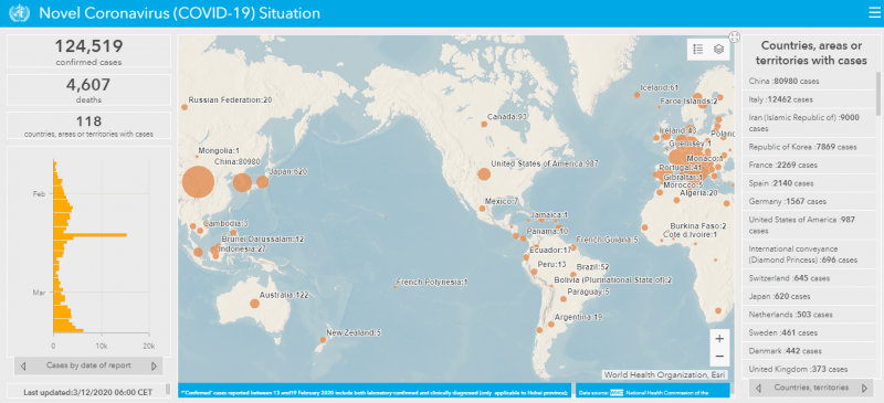
World Health Organisation
If you’re not big on the visual aspects and just outright information on the spread of the COVID-19 pandemic, the WHO’s dashboard is much better and cheerful for you.
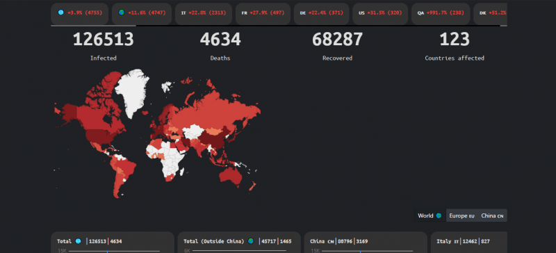
The WuhanVirus
This site might seem too serious for some but after using it for a while, you can actually tell how useful it actually is. The spread of Coronavirus is indicated in red-and-white country shapes. But you also get to receive timely news updates on the pandemic across the globe with the site’s owner being quite active.
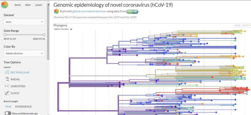
NextStrain
NextStrain is pretty technical, but if you want to see a little more information about how the disease has spread as far as it has, its map is by far the most informative. It breaks down the genome of the Coronavirus, alongside an animated map showing the routes by which it travelled from country to country. It’s a little more esoteric, but I found it fascinating.
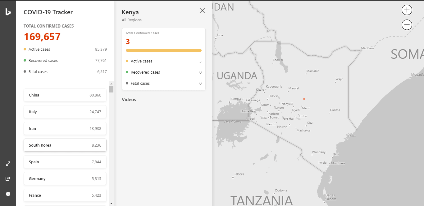
Microsoft COVID-19 Map Tracker
Microsoft is aggregating data for the dashboard from trusted sources. This includes the World Health Organization (WHO), the US Centers for Disease Control and Prevention (CDC), and the European Centre for Disease Prevention and Control (ECDC).


Comments