Xiaomi is a brand that’s not new to tech enthusiasts and the company has been selling their products in the country for a while now. Something that you may have noticed is that Xiaomi is not afraid to try out weird stuff. Whether it’s launching bizarre tech like a USB-powered fish tank or a transparent TV and even a charger that powers your phone over the air, we bet you one thing you did not expect is the company to spend KES. 32 Million on a “new” logo.
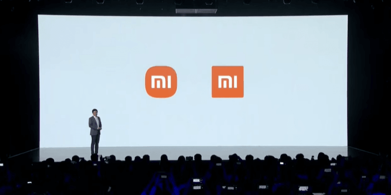
New is in quotes because essentially what happened is that Xiaomi spent 20-minutes on stage talking about their new rebranded logo only for the reveal to showcase a logo that’s quite similar to the previous one but now with rounded edges. Even more bizarre are reports that the Chinese company paid slightly over 32 million shillings to designer Kenya Hara for the redesign.
In a launch video, Kenya Hara says that the new logo “is not just a simple design of the shape,” but it in fact an “encapsulation of Xiaomi’s inner spirit” – whatever that means. He goes ahead and claims that the logo is intended to convey the essence of a single word: Alive.
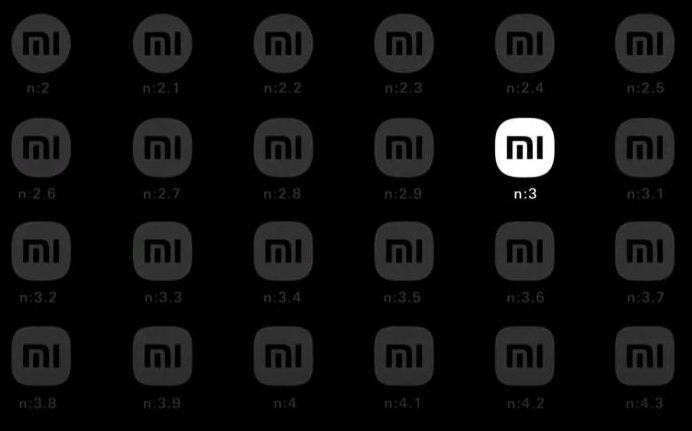
Don’t drop your mouth yet, there’s more. According to Kenya, the team behind the design used mathematics to find the perfect middle ground between a square and a circle. Out of twenty-four options that they could come up with, the team opted for shape n:3 (as seen below).
It’s not the first time we’re seeing such a redesign, lots of companies have changed much less and went on to justify the change. Besides the story behind it, we actually like Xiaomi’s “new” logo.


Image Courtesy Xiaomi


Comments