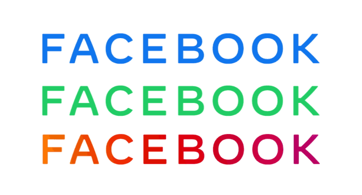
Facebook Inc, the company that owns the world’s most popular social media platform has a new logo.
Yup, there are two different kinds of Facebook. Facebook the social media platform and Facebook the company. Alongside the social media platform, Facebook also owns WhatsApp and Instagram among other platforms including Oculus.
So, the new logo in question is for the corporate business and not the social platform. Anyway, back to the topic. Facebook’s new logo, what do you think about it?
The logo uses custom typography and according to the company, it’s “designed or clarity”. The new logo is also meant to create a visual distinction between the company and the social media platform.
So, if you see the “normal” Facebook logo that you’re used to, you know that the social media platform is being referenced but if you see this new one, you know its the company.
Ugly and Boring?
First impressions of the logo, from both local and international media is that the new logo is ugly and boring. We don’t want to share our own opinion just yet, so we’ll let you read what others are saying:
“The new logo has this flat font type that you normally see in perfumes” – Kiruti Itimu, Techweez
“Facebook has a new logo that’s really boring” – Dickson Otieno, Tech-ish
“The logo just says ‘Facebook’, but in a really bland and generic font that looks like it would fit well on a credit card” – Jacob Kastrenakes, The Verge
“Facebook’s new corporate logo is as boring as they come” – Philip Berne, Android Central
What’s Your Opinion?
Here’s the logo once again, look at it carefully. What do you think?


Image Supplied
[polldaddy poll=10450080]


Comments