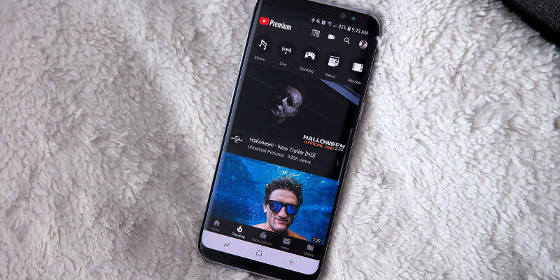
Youtube just did a design revamp on its mobile app version. The new design that comes days after Google‘s announcement, is mostly noticed by the new positioning of the comments section. YouTube mobile users can now view and post comments box that has now been moved just underneath the playing video. This is different from the traditional position where you had to scroll all through the recommended videos list.
According to Google, the new design had already been working during beta as more users had been writing comments more. Additionally, Google has also brought in new large thumbnails in the “Up next” feed. This is meant to help users see more info about each video at a glance.
“You’ll also notice channel icons below each video to help you recognise your favourite creators while you scroll through the feed,” Google said while explaining the new YouTube update.
As promised last month as well. Google has also added “Community Posts, “YouTube Mixes” alongside the videos in Up Next feed of a video page.
At the same time, Google intends to bring a number of changes to YouTube Music that will include an ‘Explore’ tab to help users find new music. The Explore tab will also contain ‘New Releases’ and ‘Moods and genres’ tab to offer a variety of music options.
Furthermore, users can also check out the lyrics of a song directly on the page where the music is being played. Despite reports of the feature not working well right now, Google will hopefully be updating it further shortly.


Comments