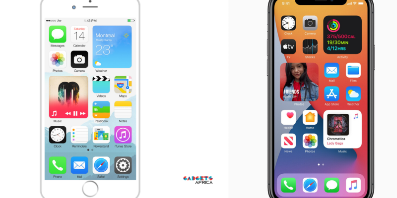
When Jay Machalani, a UI/UX Designer created, designed and envisioned how iOS widgets would look like, he thought he would get the recognition he deserved for the work he had done. Now, 6 years down the line at WWDC, Apple release iOS 14 and Jay can’t help but note the obvious similarities to his work. Did Apple take all the credit for his work?
Where it All Began
In 2014, Machalani blogged about his design ideas in a comprehensive text titled ‘Pushing iOS’. Here, he detailed every little thing that he thought was Apple’s problem with iOS, why they weren’t selling well and included some of the ideas we can now see as iOS 14.
Six years ago, I thought the home screen was old and needed that change — better late than never I guess. It lost the consistency in the Blocks / Widget design, but it looks great!”
At that time, even the media picked up on it. Most notably, The Verge was covering it and seemed very enthusiastic about the updates. Finally, a way for Apple to bring the functionality of Windows Live Tiles and Android’s widgets to iOS.
All this without undermining the simplicity and cleanliness of the operating system’s interface. Here’s what it looked like at the time.
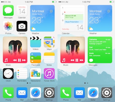

Apart from the detailed piece, with images, mock-ups and designs, he went ahead to make a video with After Effects which he then posted on YouTube. The video now has nearly 4 million views. So it could be safe to say that someone at Apple must have watched this video.
Whether they saw it or not is up for debate. However, at least to me and most others, it all looks pretty similar. Well, at least in terms of design, to what Apple launched at WWDC. Here’s the proposed iOS 14.
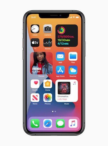

Did Apple Do Him Dirty with iOS 14?
Well, that’s the question to beat. Assuming they picked from his designs, it took six years for Apple to implement them. But’ that’s not even his problem. He’s just shocked that Apple would remain quiet for all this time.
For better contrast, let’s look at something else he did and the recognition he got. In 2013, Machalani worked on a project he called “Fixing Windows 8.” Microsoft got wind of this and flew Machalani to its campus. They offered him a job and even gave him some of its hardware. With Apple, Jay notes that it has been quiet.
He went back to the initial blog and edited the post.
Before anything, congratulations Apple on this fantastic implementation, the widgets really look great. They’re truly a 2020 version of the iOS Blocks. I just want to say that it’s a bit sad that Apple, in 6 years, didn’t try to reach me. I didn’t expect money and I don’t even want the credit or anything. I just want better tech and better UX/UI.
He also took to Twitter to post a video congratulating them of the same work.
Such a simplistic brain. You’re suggesting success of this is centered solely on visuals. Jesus. Wish more people got this. “X brand did it first…”?! is not just about the “concept”. Its about the whole systemic implementation of it, the experience, .. visuals are 5%! Cringe.
— Brad Prick (@BradPrick) June 23, 2020
However as you can see in the response above, many people say that the design is only 5% of the work. Yes, it would take a lot of time to implement this idea but I wouldn’t say it’s only 5%. There’s a lot of research that goes into ideas, plans and designs.
Looking at this, we can’t blame Apple. He publicised his work and maybe someone did see it and Apple are at no fault for taking as much time as they did. However, all I have to say is that Apple should have at least appreciated the effort as Microsoft did.
He’s Not The Only One…
Earlier this year another designer, Alexander Käßner, created mockups of a sidebar-style menu for iPadOS. Apple unveiled something almost identical to Käßner’s vision with the iPad OS 14.
Nevertheless, whatever happens, Jay says he is not after money, free iDevices, or fame. He just wants better tech, better tools, better competition, and better UX/UI.
Maybe a ‘Hi’ from someone at Apple would be nice!



Comments