Nokia 3.2
A smartphone that simply gives and takes at the same time
The Good Stuff
- Battery life
- Design
- Size
The Thorns
- Performance
- Display quality
The Nokia 3.2 is among the latest devices launched in 2019 alongside the 4.2 at MWC. Having this smartphone in your hand would automatically give away that its predecessor, the 3.1 was used as a guiding factor for its general design and features. But without referring that much to Nokia 3.1, does this device stand out on its own as a game-changer in the low-end market?
Well, yes and no. But we’ll talk about that later on.
Design and Display
Taking this off of its very familiar packaging and having it in your hand immediately shocks you at how light it feels. Considering the fact that Nokia went with a device bigger than even the higher-priced 4.2, we found it surprising at how light it feels even compared to the 4.2 to a point it almost feels fragile.
This is even despite the fact that it weighs 181g compared to 4.2’s 161g. Now, this may be a solid plus for those who want to even forget they are carrying a smartphone in their pockets. I don’t know how they did the magic here but no one really likes a hefty gadget.
The plastic chassis starting from the back clearly gives you the idea of a non-removable battery kind of system, minimal in curves and extra features and one that makes it look almost cheap. You would definitely not compare this to the 4.2 that instantly makes you feel important or the 9 PureView that is on a whole other level.
This is not to say that the dark colour we chose to go with makes it look sleek enough with the brand name sticking out bright and proud under the single-camera module. Together with the back being an obvious scratch magnet, one bummer that was an instant turn-off was when I tried reaching out for the fingerprint scanner only to find there isn’t one. It’s 2019, Nokia. Why?
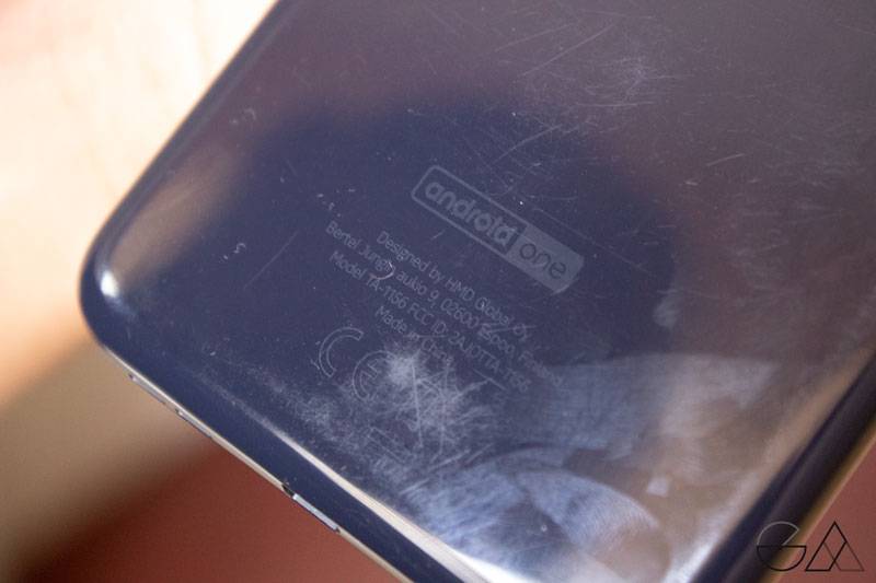

Scratches showing on the body of the Nokia 3.2
The bottom of the phone packs a stereo speaker that sits next to a micro USB port which might be another minus for those who are looking for fast charging smartphones.
With time, one does get used to the fact that this is not a high-end phone and you finally get to co-exist well with it. The 3.5 mm headphone jack at its top is one that makes you glad about the fact that Nokia has chosen to stick with this phenomenon that is being eliminated by other brands all over. However, with the 9 PureView coming in with no jack, does this mean that future versions say the 3.3 will come without one? Fingers crossed!
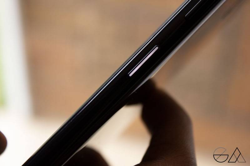

The right side of the device then brings in the normal volume buttons that we are all used with a glowing notification button, which after using it with the 4.2 and now this, it’s honestly growing on me, to say the least. The classy feel that it gives when a notification comes on is really thrilling but all that is watered down by the Google Assistant button that will still not convince me to like. It has no purpose.
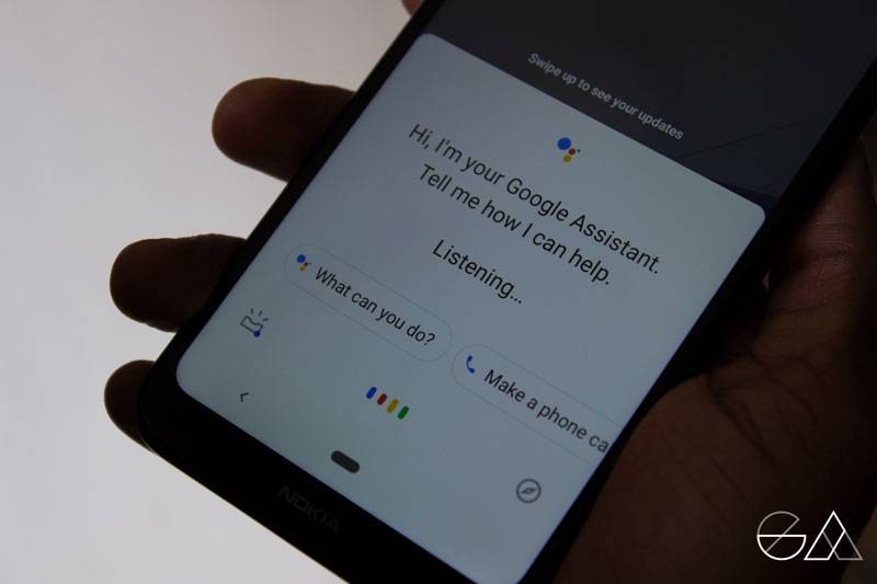

Flipping over the smartphone gets you to a huge 6.2-inch display with 19:9 aspect ratio and thin top bezel that is cut short by the teardrop notch to house the selfie camera.
Lighting it up will however let you down as with the level of resolution the colour doesn’t pop up that well and the brightness is not as good as you would want it to be. The 720 x 1520 pixels seemed better to some point compared to the 4.2 or it could just be that the screen provides a wider view.
The low brightness would, nevertheless, not be a nuisance for users who loathe brightly lit displays or are affected by them. Watching videos and normal navigation is still possible with the display even though one may wish for it to bring the smoothness that the likes of the 7.1 come with.
You may argue that as a budget a smartphone, one shouldn’t expect too much but it wouldn’t hurt to get a better resolution and pixelation as taking pictures to view is almost instantly made a disappointment.
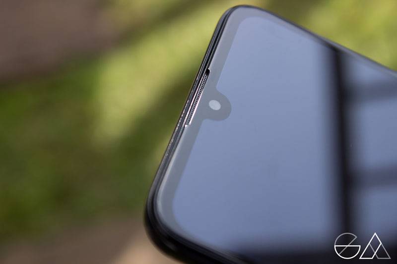

Generally, though, the overall look of the device sets it at an almost prestigious level with other handsets that are of far greater value, which is a reputation Nokia is clearly still building on.
Performance
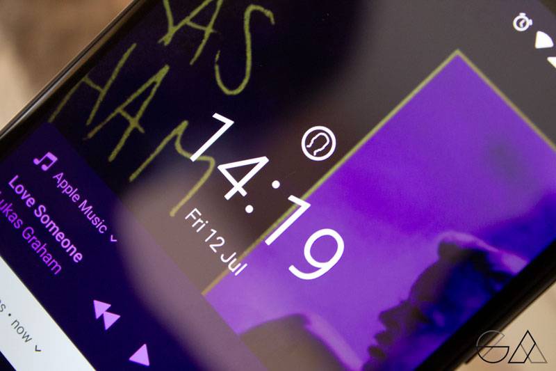
Just like every phone on the Nokia line up right now, 3.2 runs on Android Pie complemented by Google software template. The stock Android made possible by the Android One program that still shows the never-ending faithfulness between the Finnish company and the global tech giant.
This together with the resolution that still has a huge room for improvement, is powered by a Snapdragon 429 chipset that still sets it back when it comes to providing the ideal everyday performance. It is, however, something that anyone can live if you are patient enough with a navigation that is just average.
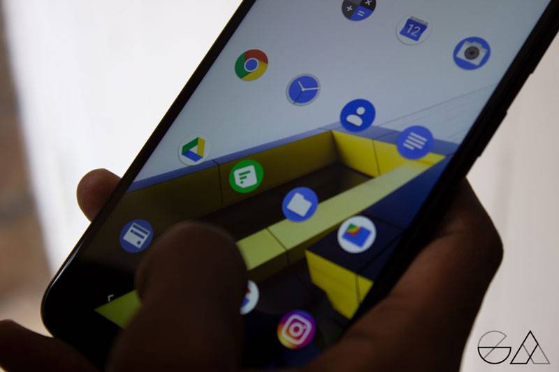

Opening up apps is something you may not be impressed with and even some may find it annoying at times but it does its work. This comes alongside in two options: 2GB that teams up with 16GB of storage or 3GB with 32GB of storage.
I would never recommend the former variant as we found it to be a complete annoyance. 16GB of data for someone with over 50 apps is absolutely useless as, by the time I was done with initial setup, the system was already asking for space free up.
Despite an averagely good performance, security features on this huge phone were really lacking and by that I mean, no fingerprint scanner. Yes, the face unlock is made possible to kind of compensate with the former but one that we found to be annoyingly slow. Having to pose properly for the phone to identify you and then light up is a task that many (including me) may find to be too much.
But you can still use the old password unlock feature. Trust me, it still works like a charm.

Camera
The Nokia 3.2 is no guru when it comes to photographic prowess as it only packs a single 13MP rear camera and considering the trend by almost everyone to have a multiple lens setup, you might think that the results with this are the lowest of the low but that’s not the case.
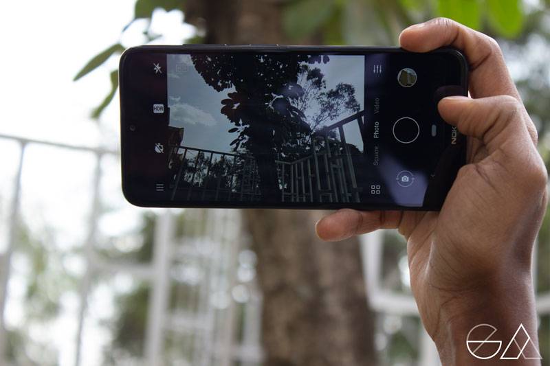

The pictures we took with the device turned out to be fairly decent though not the best. Outdoor photos under the bright sunlight are pretty natural with no automatic adjustments or extra colour pop. You may find the pictures to lack a bit of detail but if you are one to use yours for social media and basic photo-sharing and not for professional purposes then you can actually get used to it.
- rear camera
- selfie camera
- rear camera
This comes almost the same as the 5MP front camera that offers no breathtaking results. So, do not expect your face to be made perfect for Instagram or to receive too much detail.
Battery Life
With the low resolution and average performance, you would think that Nokia would choose to cut back on the device’s battery size, but with a 4000mAh battery, we were honestly impressed with how long it gets to last on a single charge.
Charging does not take that long, which is another surprise and with the charge lasting about a day and a half, the 3.2 might just be one of the best smartphones in terms of power.
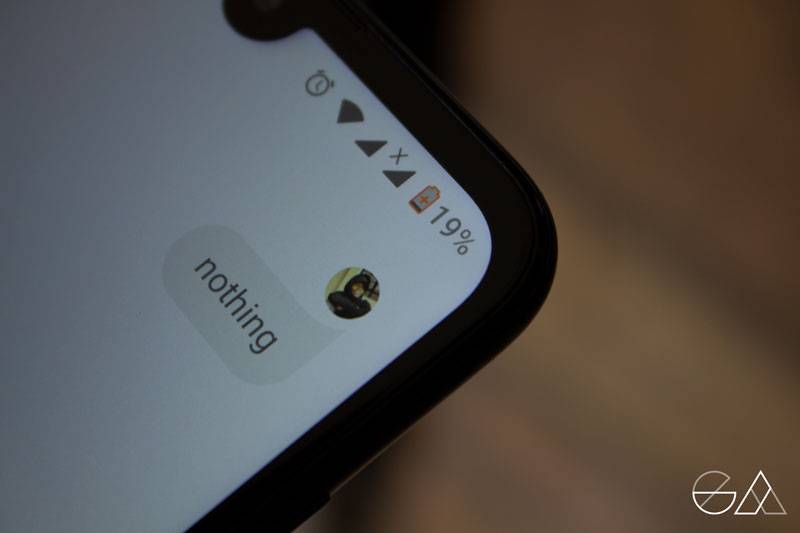

Exposing the phone to WiFi and excessive workload would last you a couple of hours which was still worth it compared to other rivals in the same price range.
Verdict
Nokia 3.2 may lack some essential features that would have complimented when it comes to the camera and specs but it is one that really feels sturdy enough for its price range.
The design may get to turn some people off but the weight is definitely worth it. The fingerprint scanner may be absent but you have the face unlock. The camera may be minimalistic but the photos are not that bad. The resolution and display smoothness may be average but the battery is one that’s impressive.
If you are catching up on this pattern, then you will notice that the Nokia 3.2 is one that gives you one but cuts back on another.
So, yeah, it’s not bad but neither is it the best. It’s clearly tap dancing at the middle level which some may find as mediocre while some may find as good enough. So for a starting price of Ksh. 13,300 to around Ksh. 14,000, would you get it?




Comments